Today we turn our attention to SharePoint modern web parts which allow you to add links to your page, to take people to content elsewhere within or outside of SharePoint. These include the Hero web part, and two types of link web parts. This is part of our ongoing series on modern SharePoint web parts, as we deep-dive into each web part, its configuration options, and usage.
Hero web part
This is an attractive web part which allows you to add visual links to pages, images, or documents in various layouts. It works best in a full-page (Communication site) or single-column section. Microsoft has quite a detailed page about this web part, as it’s a big part of a Communication site.
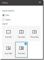
You would first want to select a layout, choosing anywhere from one to five tiles (five is the default) or layers. Tiles gives you one large tile and multiple smaller tiles, whereas Layers is a more vertical layout showing an image and text alternating from side to side. The layout is the only thing you can specify in the Hero web part’s main configuration pane. If you’re using the Hero web part on a Communication site, the layout will depend upon which type of site you chose: Tiled is the default for a Topic site, whereas Layered is the default for a Showcase site. But you can still change this by editing the web part.

After choosing the layout, click on any tile or layer to add a link. This can be to a document, image, or page within your SharePoint site, or you can link to another URL (including external sites) if you’re sure your users will be able to view it.
Note that you’ll probably want to only link to items with an associated image, as this web part is really meant to give visual interest to your page. If the user clicks on the image, it will open the image link, or if you linked to a document then the document will download.
Click Select Link in one of the Hero content areas, and the standard interface to select items for modern web parts will appear. We’ve covered this UI element in past posts. After selecting an item, an image from the link will be displayed automatically; for example, this might be an image from a document you’ve linked to. When you hover over the tile or layer, you’ll now see a small edit icon in the lower right, which you can use to edit the link text, image, and some other options – the sections are described below. There are also tools to set the focus of the image, and to zoom in or out. In the lower left is a Move icon, to move the tiles/layers around within the Hero Web Part.
Hero Web Part tile options
Link (this section is not expanded in the screenshot above): Here you can change the link you initially entered, and enter text for a Title (in this example, I typed “Web part connections”). You can also choose whether or not to display the Title in the layout.
Image: By default, an image is auto-selected (seemingly randomly) from your document, or if you’ve linked to a SharePoint page it’ll display the page header. But if you wish, you can select the Custom Image option, which allows you to upload or select an image to display. If you’ve linked to something without an image which the web part can auto-generate (which seems to include many external links), then you would need to add a Custom Image. A third image option is Color Block, which takes its color from your site’s theme. You can also type some Alternate Text in this section, an accessibility option for those who cannot see the image.
Options: Here you can choose whether or not to show the Call to Action link, and if so, what text to display. The Call to Action is what allows your users to click to download the document, if that’s appropriate, or Learn More if it’s a link to a page. The Call to Action option will be disabled by default if you’ve linked to an image rather than to a document or page, and the option is not available in the smaller tiles of a tile layout.
Note that as of August 2019 you’re now able to add a secondary call to action by entering your own text and URL. If you do that, when a person clicks on the image they’ll go to the link/document you specified, but if they click on the custom Call to Action, they’ll go to the secondary link you’ve entered. In our example, clicking on the image takes the reader to an internal SharePoint page about connecting web parts, while the Learn More call to action link goes to the Microsoft documentation about that feature.
After you have published the page, you’ll be able to click on the tiles/layers, or calls to action. External links will open in a new tab, but internal page links will open in the same tab, taking the person away from the current page, just so you’re aware.
The Hero web part gives you yet another tool to create beautiful content on your modern SharePoint page.
Link web part
The Link web part is a very basic web part which allows you to enter a single link to a URL, and displays a preview of the page, video, or image. You can choose to remove the display of either the URL or the preview by clicking the x next to it. There is no Edit icon because it has no configuration options. As we said, very basic! But it’s a good way to add one or two visual links to your page, as opposed to adding a whole Hero web part, or a group of text/icon links in the Quick Links web part – more about that below.
Note: The Link web part is only available for SharePoint Online.
Quick links web part
This web part essentially allows you to “pin” links to your page. When you add the web part, you’re presented with an Add a link icon. When you click on it, you can then choose from the standard set of content as mentioned above. Once you add a link, an Edit pane for that link becomes available, where you can edit the URL, the link Title, the image, and the Alternate Text. The Thumbnail image can be Auto-selected (for example an internet icon for an internet link), or you can upload a custom image, or search for one of dozens of icons.
The Edit pane of this web part itself gives you the option to choose from six different layouts, each of which may have additional options. Notes on each option follow below…
Quick Link web part layouts
Compact: The default option. Select whether or not to show a thumbnail image.
Filmstrip: The image will always display. You must select some other option to be able to re-order links in a filmstrip, because there isn’t a way in the UI to drag the links.
Note: the remaining options are only available for SharePoint Online.
Grid: Useful if you have many links. Each link will show the thumbnail and title, so if you really want it to appear as a grid, the web part needs to be in a section which is larger than 1/3.
Button: This option is the most configurable – see its options in the screenshot. You can display a description and/or icon, or neither; choose to have a button outline or not, or a button color; and whether to display the title at the top or center of the button, or on one or two lines.
List: You can choose to display a description and/or icon, or neither (i.e. just the title).
Tiles: Here you can choose an icon size from 5 options, from Small through Fill Space, and also whether to display only the icon or image.
This is a fairly flexible web part for displaying basic links which might not benefit from the “Hero” treatment.
Wrapping up
As always, SharePoint Online is ever changing, so please check back in with us to read about new options available for linking to content from your SharePoint page.
Next time, we’ll look in detail at the List and List properties web parts, which we did cover somewhat in an earlier article about web part connections.


